Your site may look fine on your desktop. Google ranks it mainly on what people get on a phone.
Pages that look great on your office monitor can be slow, cramped or hard to tap on a phone. That costs you more than you might expect, because Google uses mobile-first indexing. In plain terms, it treats your mobile site as your real site.
We make your mobile pages fast, easy to use and comfortable to tap. That meets Google’s technical requirements and gives phone visitors what they expect.
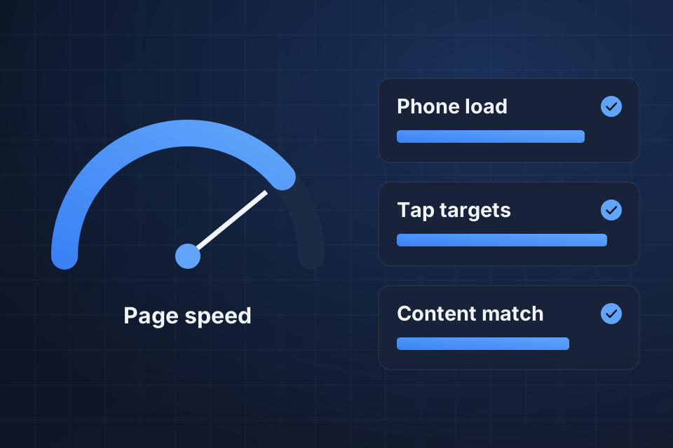
A site that meets mobile-first indexing requirements
Menus and buttons designed for touch
Faster page loads on phones
A responsive design audit, with the fixes made
We run Lighthouse audits and test on real phones, which catches problems automated tools miss.
Mobile and desktop pages get compared, so nothing Google needs goes missing on phones.
We correct tap targets, font sizes, viewport settings and menus that are hard to use by touch.
Mobile pages get faster, then we retest on real devices to confirm the fixes hold.
We’ve grown organic traffic for companies across various industries. Mobile work protects that kind of growth, since weak phone pages drag down your desktop rankings too.
It means Google primarily uses the mobile version of your site for crawling, indexing and ranking. If your mobile experience is poor, your desktop rankings will suffer too.
Start with a Lighthouse audit, then try the site on real phones. We do both, because manual testing on actual devices catches problems automated tools miss.
No, it’s the minimum. Mobile SEO also covers tap target sizes, font readability, viewport settings, page speed, and matching content between mobile and desktop.
Leaving content off the mobile version that appears on desktop. Google works mainly from the mobile version, so anything missing there may not be indexed or counted for ranking.
Tell us about your project and we'll get back to you within 24 hours.