When a new button or headline doesn’t help, the trouble is often the steps themselves.
Your signup has steps nobody needs. Your checkout asks for the wrong things at the wrong time, or your onboarding loses people in the first minute. Polishing one screen won’t fix any of that.
We redesign the flows where friction is highest. You see a clear before and after, and the new version is measured against the old one, so you know what the work achieved.
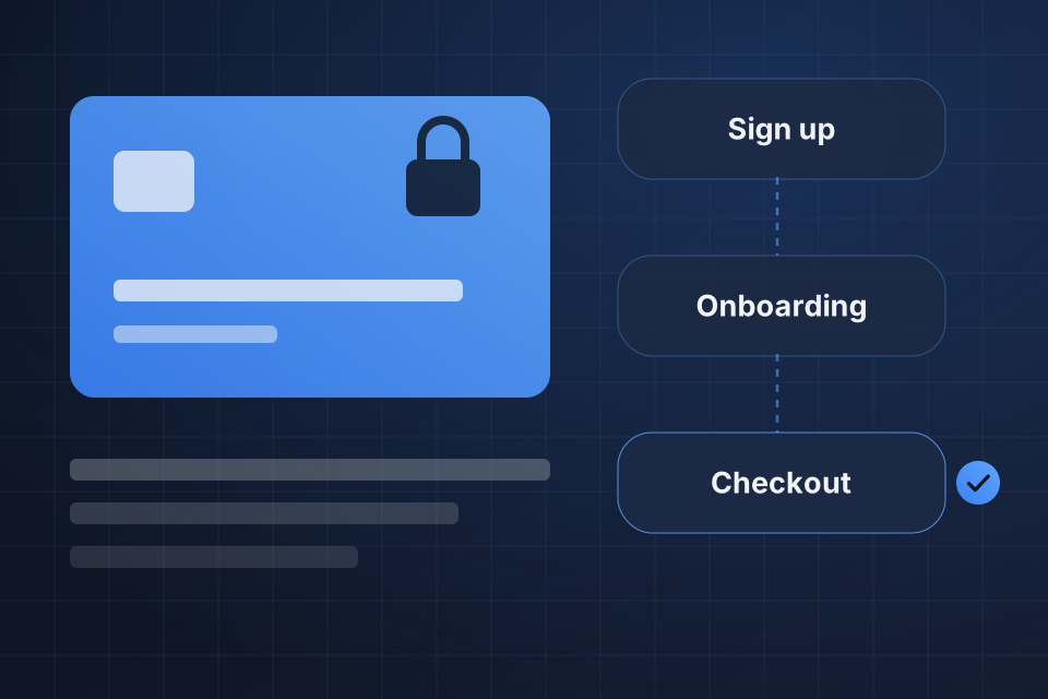
A full map of the current flow with friction points marked
A new flow shaped by your analytics and proven UX practice
A phased rollout, so changes are proven before full launch
Post-launch measurement against the original flow
We chart every step as it works today, marking where people stall and what already works well.
The new version sets which steps stay, their order and what each one asks, along with layout and copy.
Changes go live in phases, so each one is proven before the full launch.
After launch, we measure the new flow against the original and show you the difference.
Checkout, signup, onboarding, account creation and key conversion paths are the most common. These are the flows where small improvements have the largest business impact.
Both. A flow redesign usually changes the logic, meaning which steps, in what order and what to ask. It also changes the visuals, such as layout, copy and hierarchy. We handle both or work with your design team.
We study the current flow first, identify what’s working and keep it. A redesign should remove friction, and it shouldn’t take away things your users already rely on.
Either. We can hand off finished designs for your developers to build, or we can implement directly on most platforms. The scope follows what your team needs.
Tell us about your project and we'll get back to you within 24 hours.